Carlos Miele Spring/Summer 2013

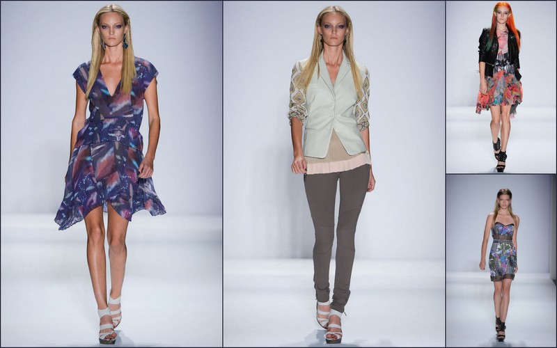
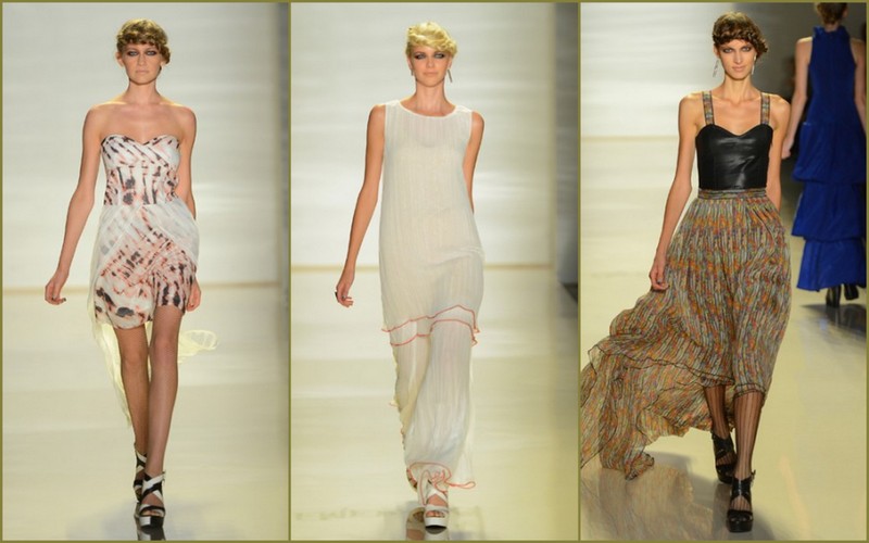
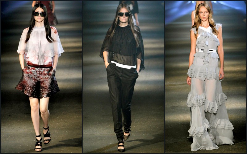
Carlos Miele has always injected lots of color and vibrancy into his collections. After all he is from Brazil.  Miele’s cultural background aside, Miele’s collection’s—though influenced by his native country—transcends the sounds and colors of Brazil.

That said; Miele’s inspiration for his spring/summer 2013 collection was the jungle, a psychedelic jungle to be exact. Take leopard, giraffe, tiger, and zebra print, mixed in a vivid, neon color palette with sequined and jeweled embellishments and you have Miele’s interpretation of mutated zoology with special effects. Sometimes it worked beautifully; other times, it was a whole lot of look.

Miele’s miasma of color in this outing worked best when he paired the psychedelic animal prints with a solid color. Miele’s green zebra print silk chiffon blouse paired with green, pleated silk charmeuse, wide-legged pants was particularly attractive. And Miele’s oxidized yellow tiger silk charmeuse handkerchief hem dress was another standout.

Carlos Miele spring/summer 2013 images courtesy of style.com

Though Miele did not stay with his jungle theme throughout the collection, his solids did not distract from the overall theme of sensual, easy clothes that alluring, fun-loving women would wear. And as always, Miele knows how to put on a show that is upbeat, dynamic and attention grabbing.

In that respect, he never fails!!

—William S. Gooch
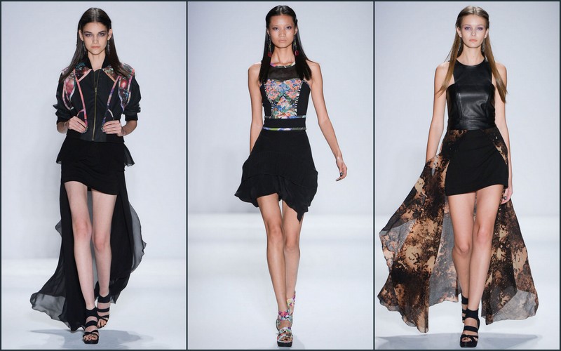
Nicole Miller Spring/Summer 2013

It’s no secret that designer Nicole Miller has been pushing to give her venerable label a more youthful appeal. Her company’s efforts were chronicled earlier this year in the Sundance Channel series All On The Line, a reality series that follows designers as they try to revive, or in Miller’s case, revamp their lines with the help of Elle Magazine‘s creative director Joe Zee. And Miller recently launched a new ready to wear line, Artelier, which has a more youthful point of view.

Miller’s spring/summer 2013 collection reflected the designer’s dip into the Fountain of Youth. For the most part, Miller hit all the right notes, finding just the right balance between youthful energy and Miller’s more traditional brand of funky chic. But there were moments when the results were contrived with the designer working too hard to make an impression. Nothing is worse, after all, than someone who tries too hard to be cool or hip.

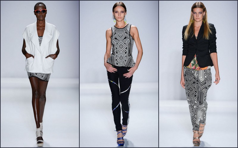
The (very) brief show notes distributed before the collection showing alluded to the challenge. Miller called her “Batteries Not Included” collection a “juxtaposition of improbable things.” And in Miller’s fashion lexicon, that meant a rainbow-bright blending of contrasting influences—digital floral prints; techno with retro; hard and soft; masculine with feminine, streamlined with flounces.

An Omni Stripe print that resembled faded rock concert glow sticks on a black background gave a series of silk shirts and skinny pants a fun, Ultra-Brite feel. Bright was also the order of the day with Miller’s purple and hot pink Future Flora floral print, which was used particularly well in looks like a funky combo print bustier dress. Techno was represented by a series in a pixilated pattern, including a striking black and white jacquard peplum top and a jacquard minidress that had an almost 3-D effect. And flowing, sheer tunic shirts sometimes topped by biker jackets added to the decidedly downtown feel.

But Miller’s long-short theme became a bit overdone. Peplums, double peplums, pleated peplums, long skirts over shorts, short skirts over long skirts and pants. The procession of looks started to feel as if Miller was ticking off items on a fashion design to-do list.

Nicole Miller spring/summer images courtesy of gorunway.com, photographed by Marcus Tondo

Still, this fresher, funkier Nicole Miller is a good push in the right direction, showing that Miller has found a way to rejuvenate her style without losing her way.

—Karyn D. Collins


Emerson Spring/Summer 2013

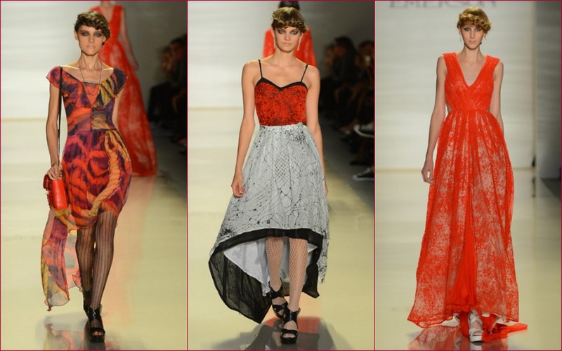
Creative director Jackie Fraser-Swan caused audiences stand up and take notice with Emerson’s spring/summer 2013 collection. While staying true to her signature aesthetic of fusing and contrasting elements of rock and romance or some sugar with a dash of spice, her 1970’s horror film‒inspired collection wowed.

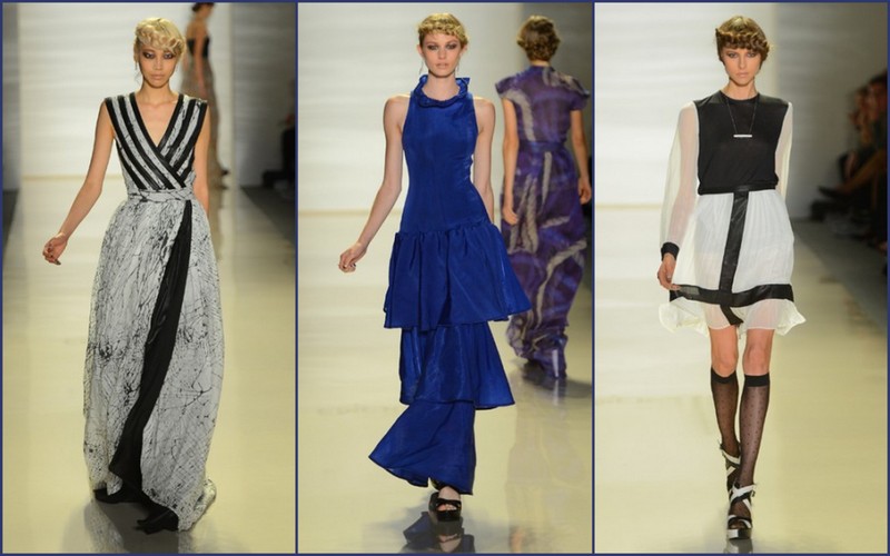
Taking cues from horror flicks like The Amityville Horror, Burnt Offerings, and Carrie, red was definitely the hot color in this collection matched against feminine silhouettes. Though Fraser-Swan consistently stayed with 70s inspired looks, she brought her point of view into the present by going a modern twist featuring sleeveless peplum, black and white varsity jackets, and electric blue gowns. Fabrications included red velvet tulle, which played an important role throughout the collection inspiration; nylon and printed silks, which helped bring her fashion-forward horror, show to life.

Emerson spring/summer 2013 images courtesy of style.com

Though this collection was horror film-inspired, without all the right elements this collection would have been too literal and just another horror film homage. Well, Jackie Fraser-Swan expertly understood how to make this outing about the clothes and not just the film genre. Fraser-Swan was able to translate her dark inspiration into an elegant yet fun collection that will definitely attract the attention of fashionistas everywhere.

—Dana E. Givens

Nina Skarra Spring/Summer 2013

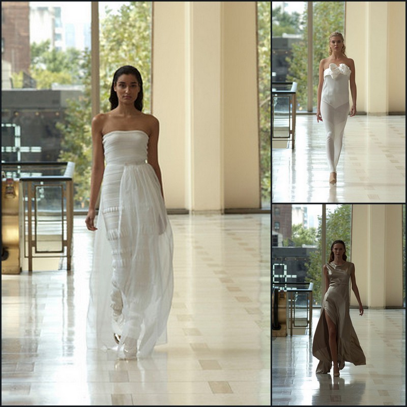
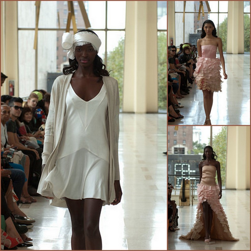
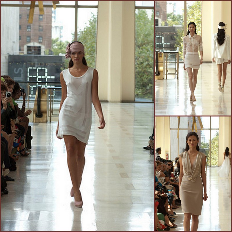
In her first Mercedes-Benz Fashion Week appearance, Norwegian designer Nina Skarra combined sleek, classic silhouettes with a minimalistic point of view. As with most Scandinavian creatives, less is always more, and Nina Skarra is no exception.

Though Skarra’s spring/summer 2013 collection harkened back to very simple 60s and 70s silhouettes, Skarra kept her collection fresh and fashion forward by incorporating new textile technologies. And by also using sustainable fabrics, Nina Skarra, without radicalizing eco-friendly points of view, subtly demonstrated that it possible to make beautiful eco-sustainable garments that women want to wear that are youthful and full of charm.

There was something in this collection for every woman. From sophisticated gowns and garden party dresses to interesting knits that can be styled in a variety of ways, Skarra understood, like many designers this season that women are looking for transitional pieces that will stay in their wardrobe for more than one season.

Nina Skarra spring/summer 2013 images courtesy of Beautiful Planning Marketing

Nina Skarra stayed with a pale muted palette of soft corals, carnation, light beiges,ecru and pale greens. Though Skarra’s silhouettes reflected back to Halston and Calvin Klein silhouettes of the 70s, by bringing in elements of padded shoulders, layering of diaphanous fabrics, latticed techniques and some peek-a-boo elements, Skarra elevated this collection from an homage to classic silhouettes we are all familiar with to her own compendium on what is going to be fresh and retail viable for spring 2013.

—William S. Gooch


Nanette Lepore Spring/Summer 2013

Nanette Lepore’s spring/summer 2013 images courtesy of style.com

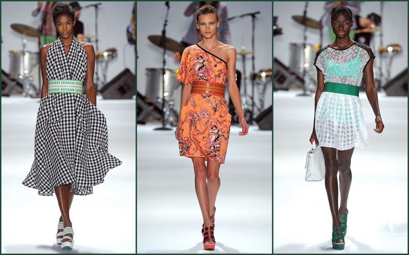
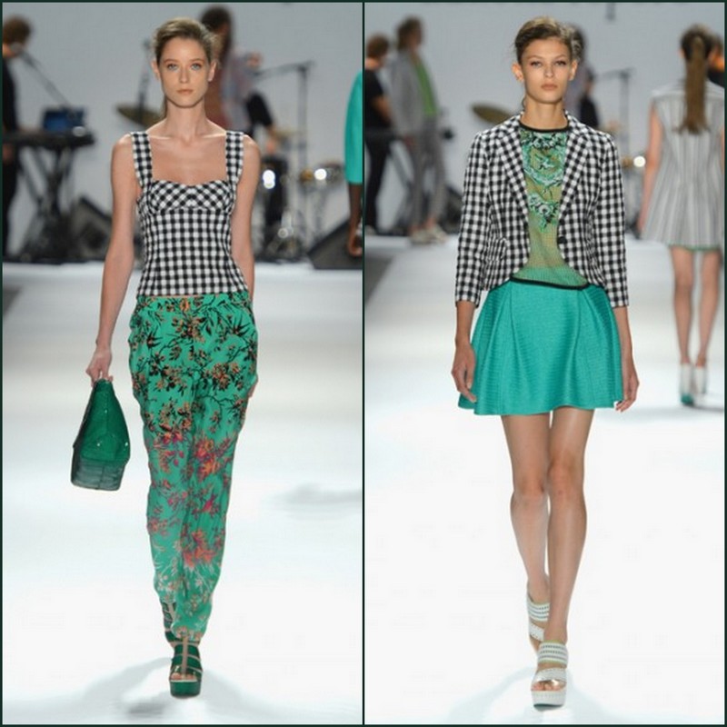
Nanette Lepore has always showed a knack for defining fresh femininity for grownups. This is a designer who understands the difference between dressing with youthful vitality and dressing like a kid. With her spring/summer 2013 collection, Lepore also found ways to bring a classic inspiration forward into the now while still retaining the beautiful essence of the original.

The collection opened with a series of looks that celebrated the lush greenery and spirit of Brazil (the show was accompanied by a live performance by the band Brazilian Girls).  And green played a key role throughout the collection in solid pieces as well as a delicate floral.

Images courtesy of mbfashionweek.com

The floral patterns were inspired by antique china from a museum exhibit but Lepore found many ways to keep the collection fresh and fashion forward.  Several pieces in a coral floral shifted from black flowers on a deep coral to white flowers on a faded coral, teasing the eye to look and then look again. Silhouettes remained simple, such as a lovely coral print v-neck dress.

A green clover print was given a contemporary edge when combined with a black and white check, a fun way to turn the traditional on its ear. The combination of two seemingly disparate patterns somehow worked beautifully as with a clover raffia jacket Lepore paired with check shorts.

And one of the most striking pieces, a simple strapless dress, was made anything but simple by starting with the dark floral on coral pattern at the bodice, shifting to an aqua floral on pistachio print at the center and ending with the coral on green clover print. It was the perfect embodiment of Lepore’s tropical classical mashup.

—Karyn D. Collins

–


Prabal Gurung Spring/Summer 2013

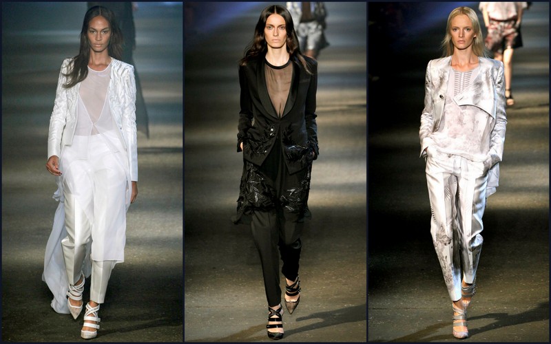
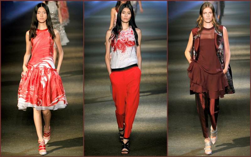
This seems to be the season for the emergence of a new millennial age of urban chic. While there certainly any number of designers exploring the bright side of summer, a large number of designers seem to have latched onto a darker, tough-edged brand of pretty.

Among those making that transition is Prabal Gurung who showed his collection Saturday during Mercedes-Benz Fashion Week at the sweatbox called Pier 57. In truth, Gurung has been gradually shifting towards a harder shade of brilliance for a couple of seasons now, a marked change from the pretty Ladies Who Lunch‒type cocktail outfits that were his initial claim to fame.

For his latest collection, Gurung said he drew inspiration from the work of the Indian-born British sculptor Anish Kapoor, whose creations include the red “Orbit” sculpture in London’s Olympic Park.  Classic Kurtas worn by women in Gurung’s native Nepal also served as a reference point, the designer said.

The mostly pleasing results in this latest collection saw some wonderful blends of these themes as well as Gurung’s trademark strengths in tailoring and his way with a cocktail dress. The show’s opening look, for example, featured a beautifully tailored porcelain silk cotton hand-embroidered jacket splashed with a Kapoor-esque aluminum and ice design that shimmered with maco beads. Other looks featured Kapoor-like “explosions” with splashes of color and/or beading. Muscle tees and tanks with graphic design inserts also gave the collection an athletic punch.

Prabal Gurung spring/summer 2013 images photographed by Monica Feudi, courtesy of style.com

And Gurung’s drop waist cocktail dresses gave the collection an extra jolt of excitement with a breathtaking combination of embroidery, hand-painted fabric and ostrich feathers.  Not every woman can pull off an ostrich feather cocktail dress, one of which bore an eerie resemblance to drips of blood. But then not every designer can make such a creation actually look appealing.

—Karyn D. Collins

Carmen Marc Valvo Spring/Summer 2013

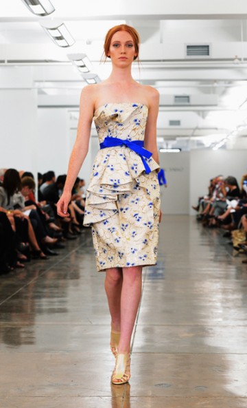
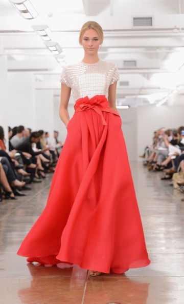
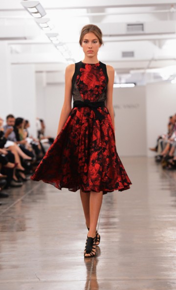
Say the name Carmen Marc Valvo and certain key characteristics come to mind —clothes that show a real understanding of and appreciation for a real woman’s body, and painstaking attention to detail. For his spring/summer 2013 collection Valvo brought those two characteristics together in a sleek, sophisticated collection that was inspired by Japanese origami.

Carmen Marc Valvo images courtesy of mbfashionweek.com

Once again, Valvo showed his mastery. Where a lesser designer might have thought it enough to show a clever knack for manipulating fabric, Valvo used the origami folds in wonderful ways to enhance and flatter the figure.

Of course everyone is utilizing draping these days as if some designers had discovered the shape enhancement effects not only look pretty, but succeed at the cash register.

Valvo’s been there, done that.

Instead, for spring 2013 Valvo’s creations featured clean lines with clever folds here and there—folds at the bust line to accentuate a belted waist, for example, a gentle cascade of ruffles down one side—a recurring motif that flattered the hips. The Japanese influence carried over to the kimono wrap style of several blouses.

A brocade in blue and black and red and black was softened by black Chantilly lace, bringing a serene but still vibrant note to the collection. color conversation happening or the season.

Among the most winning looks were Valvo’s lace glass sequined tops and bodices on gowns, which the designer said were inspired by Samurai warrior breastplates. Here was true power dressing for a night on the town.

—Karyn D. Collins

–

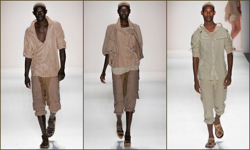
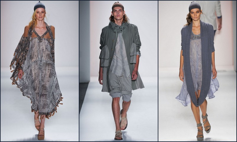
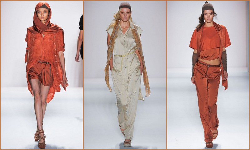
Nicholas K Spring/Summer 2013

Nicholas K, for several seasons has presented collections that have incorporated loose-fitting unisex clothing, this season Nicholas K expanded their point of view to include garments that were a bit flattering to the feminine silhouette. Inspired by the 70s science fiction cult classic Soylent Green, Nicholas Kunz has developed a collection that reflects the type of clothing needed if the earth’s population had to cope with extreme global warming. Of course this point of view fits in nicely with the brands aesthetic of draped fabrics and easy, breathable loose clothing. Still, Nicholas K found a way in this collection to expand the brand without being too literal about global warming.

Though in Soylent Green the only green left on the earth is found in green plankton, Nicholas K found a way to incorporate a slither of the green trend in this outing. Starting with sand-colored silk ensembles and progressing to steel blue and to some great burnt oranges pieces, ending with a final morsel of pale green, Nicholas K, though staying true to the aesthetic of slouchy, loose-fitting attire, found a way to tailor many of the pieces so that a wider female demographic would be attracted to this particular collection, while still holding on to its tried-and-true fans.

Though the men’s shape and silhouette did not change much from the spring/summer 2012 outing, for men this collection is still fresh, easy and fashion forward.

—William S. Gooch

Nicholas K spring/summer 2013 images courtesy of style.com

Monique Lhuillier Spring/Summer 2013

The water motif is popping up in a lot of the spring/summer 2013 collections. But of the designers this season that are looking to aquatic life and water references for inspiration, Monique Lhuillier has adapted this point of interest with a more fashion-forward sensibility than most while staying true to her signature aesthetic.

Known for streamlined silhouettes that accentuate the feminine form, Lhuillier has managed in this outing to forward her signature look by incorporating innovative textile and technologies. Lhuillier referenced the ocean and aquatic life by employing digital printing of fish images, scales and other sea life. Lhuillier also conjured up images of water and marine life by utilizing different silhouettes and shapes that spoke to the ebb and flow of the ocean. Using the peplum aesthetic, tight bodices curved out like ocean waves at the edges while other gowns and cocktail looks that began as simple silhouettes cascaded into undulating water motifs and structured arches.

In the past few seasons, Lhuillier’s collections are heavy on red-carpet gowns, and rightly so since Lhuillier’s celebrity clientele has become a burgeoning part of her business. However, a part from the fantastic array of gowns embellished and overlayed with tulle, beading and sequins, Lhuillier really struck gold with simple cocktail dresses and a few sexy, sculpted leather dresses that rounded out a collection that otherwise would have been a panoply of great gowns.

Monique Lhuillier spring/summer 2013 images courtesy of style.com

Still, what Lhuillier and designers of her ilk know so well how to do is give women lots of options for their wardrobe and present their collections, from choice of music, models and garments in a way that you never want the magic to end.

—William S. Gooch

Misha Nonoo Spring/Summer 2013

As New York Fashion Week continues to bring out all the stops from emerging designers, Misha Nonoo’s spring/summer 2013 collection was a shining beacon of how to present a relatively new brand in its best light.  With an array of tropical colors, this collection has a relaxed, laidback point of view, set against the backdrop of a peaceful evening in a crumbling elegant Cuban hotel.

The color palette resembled Latin spices evidenced in deep corals and ecru variants, as well as the bold dark blues and simple floral patterns indicative of a relaxed tropical lifestyle. The fabrics were soft and relaxed with a loose silhouette to capture images of a relaxed day under the sun. Hairstyles were Frida Kahlo‒ inspired chignon which helped set the mood.

The models posed against a backdrop that resembled a disheveled manor inspired by the work of photographic artist, Michael Eastman, who was also inspired by old Latin haciendas. “I visited Cuba for the first time 10 years ago … I love it ever since” explained Misha Nonoo. Nonoo was also was inspired by the beauty of the city centers, as well as the Cuban countryside and the carefree visage of local residents.

Image courtesy of fashionreverie.com

This collection will entice consumers to capture a bit of this sensuous paradise in their spring 2013 wardrobe. Misha Nonoo, job well done.

—Dana E. Givens

Copyright © 2012-2025 | Fashion Reverie Publications, LLC - All Rights Reserved