 Project Runway has produced a slew of credible fashion designers. Still, only a handful have gone on to show consistently during New York Fashion Week. With the exception of Christian Siriano, Irina Shabayeva, Korto Momolu, Gretchen Jones, Malan Breton, and a few others, most contestants on Project Runway are faces we only see on reruns on Lifetime and the Style Network. And while some very talented Project Runway alumnae start off strong with good press and notices, only Siriano and Malan Breton have managed to keep their feet in the proverbial New York Fashion Week pool season after season.
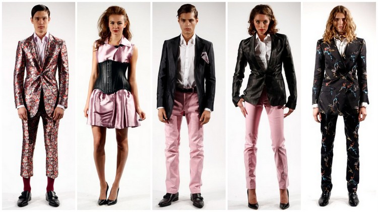
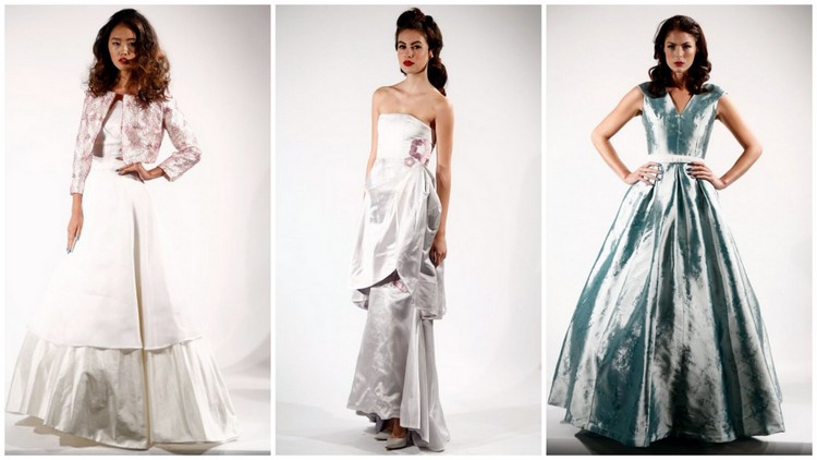
For spring 2014 Malan Breton looked to British pop groups that came to America in the 1960s as a reference point. “My inspiration for this collection was the British music scene that spread to America in the 60s” explained Malan Breton. “I drew a lot of inspiration from the silhouettes of that area and I really wanted to emphasize a woman’s curves in this collection. To add to the romance of the collection we added corsets and some very feminine elements.”
 Breton’s color palette ranged from the soft pastels of carnation pink to eggshell white, beige, nude and electric blue. “As far as color was concerned I wanted to keep it softer for the women and bolder for the men,” detailed Breton. “When it comes to color, men are becoming the prize peacock. Interestingly, roles are being switched in the market right now.”
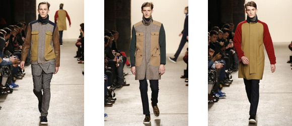
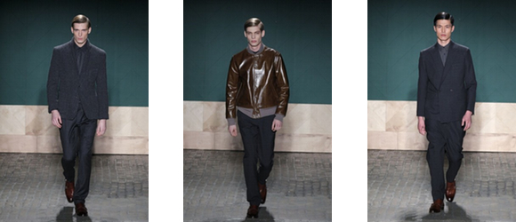
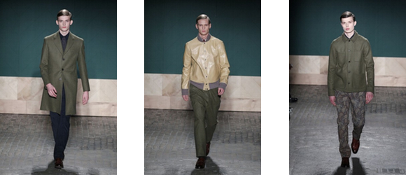
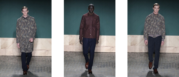
Though this was a beautiful collection, Malan Breton’s strong suit is his menswear. And though his choice and color and fabrication, especially the floral brocade suits, were daring for the male consumer, the beauty and tailoring of his men’s suits were undeniable. When it comes to his women’s looks, most leaned slightly toward wardrobe one would see in a modern interpretation of Shakespeare’s As You Like It and maybe even The Merchant of Venice. Though the women’s looks were lush, romantic and beautiful, Breton needed to pay more attention to the styling and the adage, “less is more.”
Images courtesy of nypost.com
Still, Malan Breton has found a way to continue to present his collection practically every season during New York Fashion and he has shown twice at Lincoln Center. I think his perseverance is paying off!!
—William S. Gooch
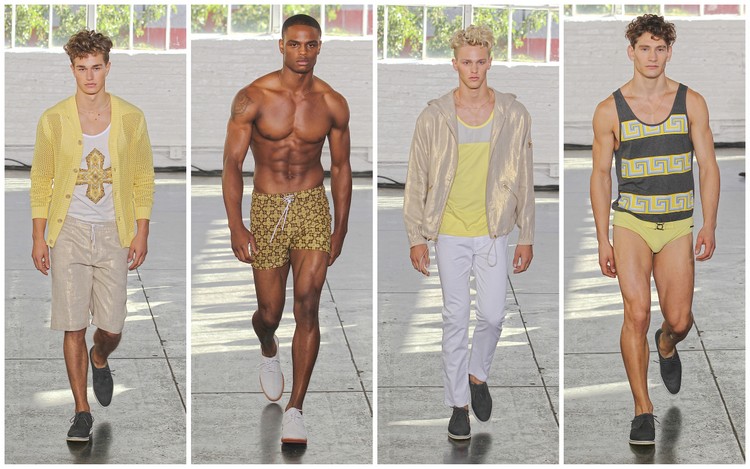
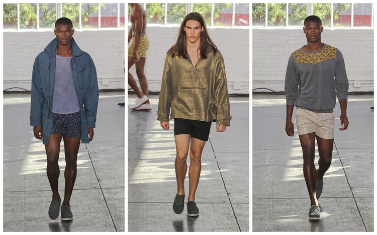 This summer idyll collection takes the Parke and Ronen man from leisure spring/summer brunches and casual workday Fridays to exotic locations along the Aegean Sea. From color palettes that played on variations of blue and gold to bold splashes of red and metallic gold, and neutrals of black, nudes and beiges, Park and Ronen demonstrated that their customer embraces bold color on masculine silhouettes that showoff a well-chiseled physique.
 There was a definite 80s influence to this collection evidenced in shorts that were mid-thigh, some identifiably shorty shorts. The design duo also borrowed highly from the late 70s and early 80s with short-sleeved, two-toned Oxford shirts that revealed light shades when rolled at the armpits, as well as 80s-influenced windbreaker jackets.
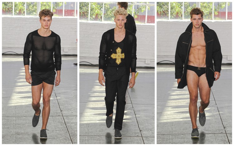
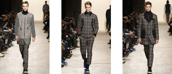
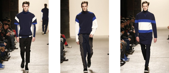
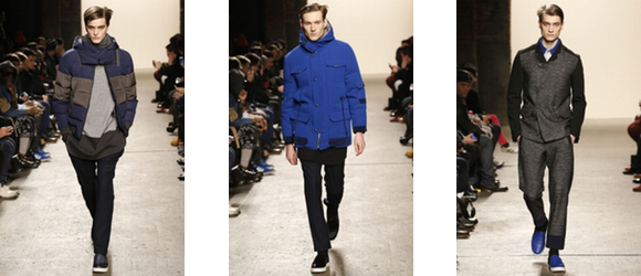
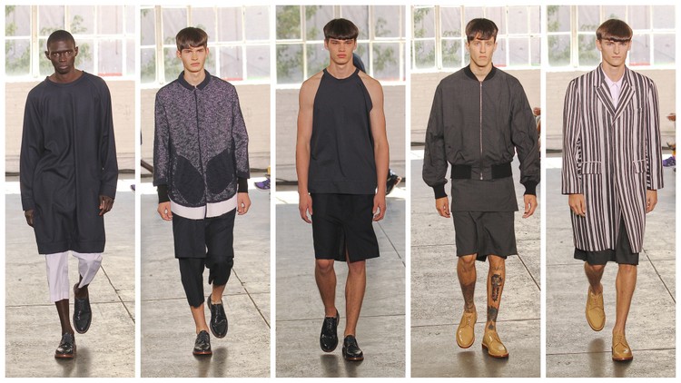
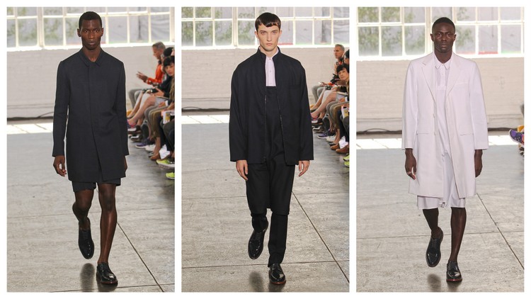 Androgyny was the order of the day for Duckie Brown’s spring 2014 collection. Yes androgyny, but Duckie Brown’s concept of androgyny. Leikeli47’s rap “Talk like a boy, dress like a girl” forwarded Brown’s fashion-forward genderbending point of view that was heavy on a neutral palette but somewhat shy on consumer viability.
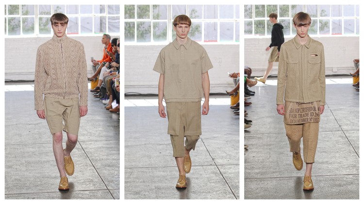 In this outing, creative directors Steven Cox and Daniel Silver chose to stay with a neutral palette and married this rather mundane color palette with looks that stretched the limits of androgyny for the male consumer. There was some genius in this point of view in that though the looks definitely expanded the definition of masculine silhouettes, there were masculine elements to most combinations.
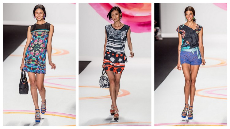
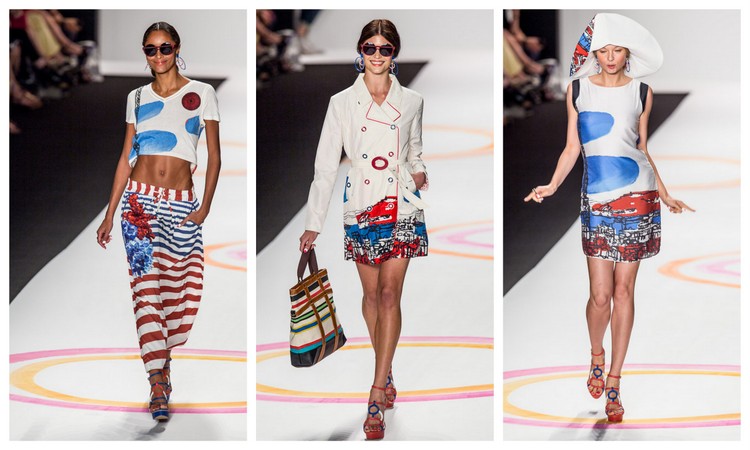 Sunny, joyous, playful frivolity with unbelievable splashes of bold color describes Desigual. Since 1984 Desigual has been the town crier for clothes that reflect a youthful, fun, positive attitude that is expressed each season in affordable bold, innovative garments for the consumer who is not afraid to express their individuality and love of life. Infuse Desigual’s signature point of view with a kaleidoscope of color, pop art, graffiti-inspired digital prints and you have their spring 2014 collection.
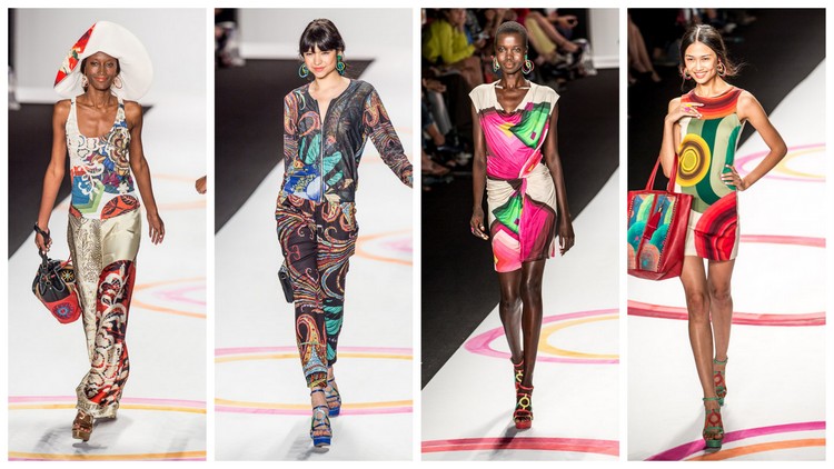 In this outing, Desigual looked to the Mediterranean and La Dolce Vita found in the idylls of Saint Tropez, Ibiza, the French Riviera, and all other Adriatic Sea hot spots. Life is to be experienced with caution thrown to the wind, which came across strongly in Desigual’s spring 2014 collection. Only Betsey Johnson produces that kind of party on the runway, and though most industry professionals attend MBFW for the clothes, Desigual’s carnivale-like presentation is a pleasant departure from the sometimes formal, but necessary promenades of well-known brands.
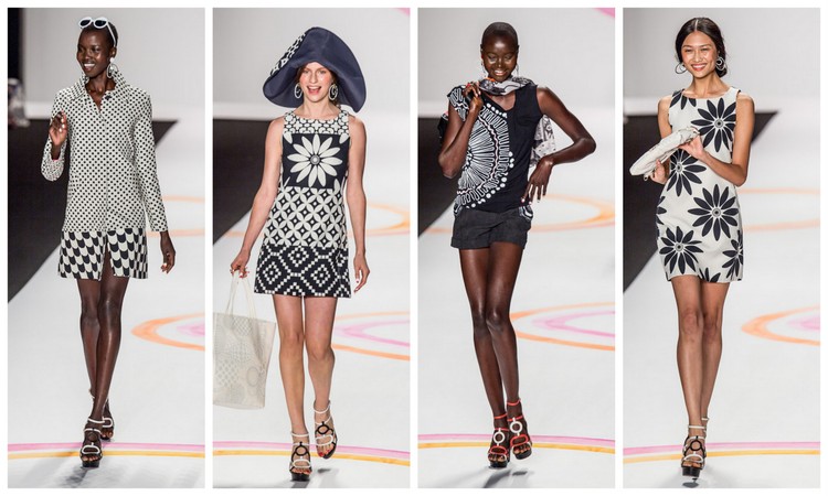 Like many collections this season, Desigual started out with black and white neutrals. But after the twelfth look, Desigual pulled out of all the stops in this 40-plus collection with a mélange of color, vibration and energy that rivals only Betsey Johnson. Though there were some great coats and colorful jumpsuits in this collection, Desigual’s separates were the true standouts in that a variety of women of different physiques and ages can implement their spring/summer wardrobes with a Desigual top, skirt, short or slack.
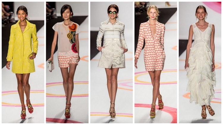
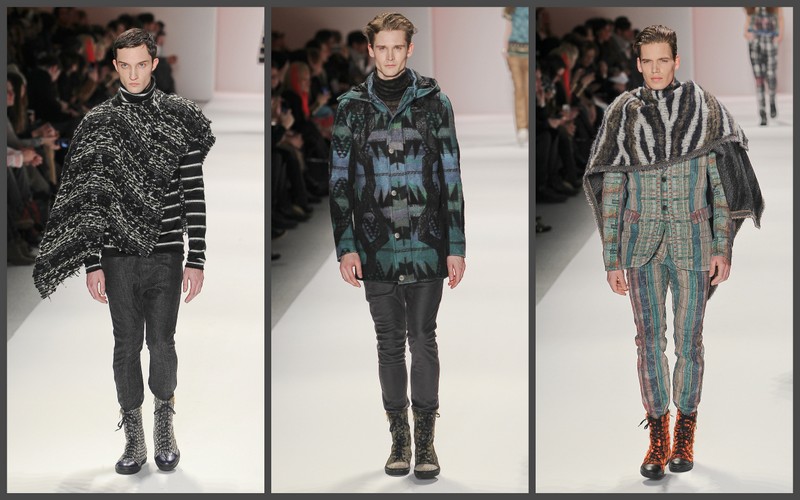
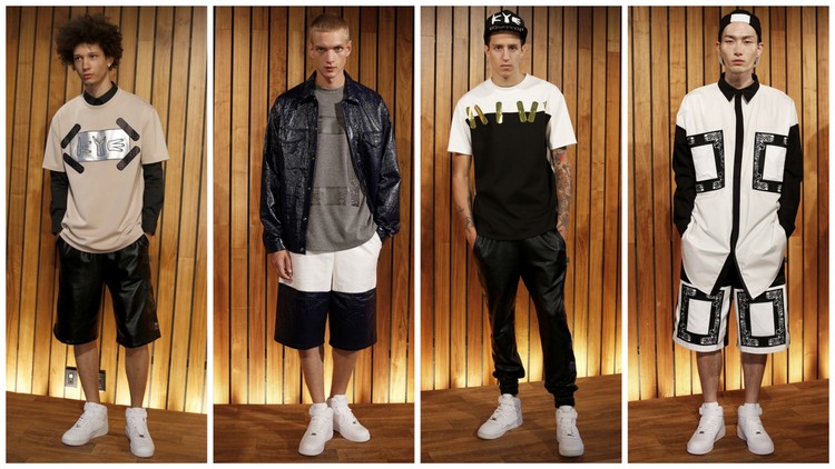
 Korean designer Kathleen Kye looked to urban streetwear mixed with a bit of glam for inspiration for her spring 2014 collection. Known primarily as a streetwear designer, Kathleen Kye has always tried to find that delicate balance between hip, urban streetwear with swagger and looks that also have a fashion-forward sensibility.
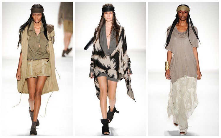
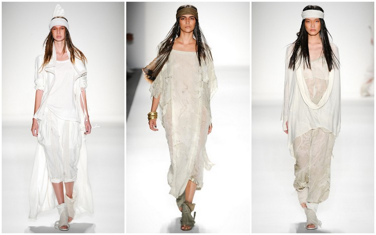 Nicholas K is known for their ease-of-movement garments expressed in drapey, soft fabrics in muted color palettes. This spring 2014 collection was no exception to the brand’s signature aesthetic. Though seen through a kaleidoscope of Native American influences, Nicholas K managed to maintain their established point of view without allowing the indigenous shaman traditions to overpower.
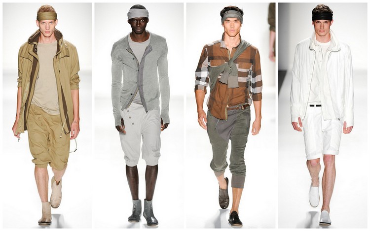 Color palettes ranged from variety of earth and rock tones to other natural element color. Tones were aptly named earth, granite, mica, smoke pattern, alabaster, and antler. As always, the brand had some great jackets and separates. Standouts are an earth-colored two-toned, Nile jacket, the asymmetrical onyx Nala jacket, and the inverted granite Mirella jacket.


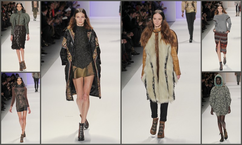 Juxtaposing hard against soft, feminine against masculine, beauty against the not so beautiful are contradictions that the fashion community has readily embraced for decades. Polar opposites can give fashion designers the range and scope to explore limitless possibilities of fabrication, texture and expand images and conceptions of beauty.
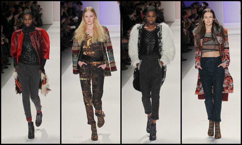 Like seasons past, Dalmau masterfully attempted to combine disparate textures and color palettes, and this collection was no exception. In fact, in this outing the delicate balance of hard and soft, feminine and masculine that Custo Barcelona in past season has expertly facilitated at times went somewhat off-kilter. The mix of leather, alpaca, Aztec tribal influences and metallic fibers, all rolled into one was perhaps too much of a fashion smorgasbord of textures and influences to provide a cohesive direction that would expand the brand’s female demographic, and may even confuse some its loyal fans. Though many of the looks had great editorial value, overall, this collection had too many ideas and needed editing.
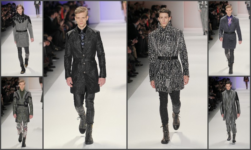 Where this collection was successful was in its menswear where the mix of fabrics and concepts actually worked. Dalmau produced several great suits and jackets that the hipster fashion guy would want in his wardrobe.